It’s Got Everything, Including the Kitchen Sink – Paramount Plumbing
Paramount Plumbing are a leading plumping supplies retailer in New Zealand, catering to a diverse range of customers including plumbers, builders and DIY renovators. Their product lines include top brands of bathroom, laundry and kitchen supplies, at competitive prices.

The Brief
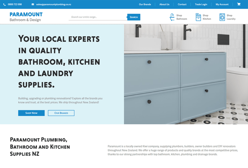
In line with their intention to focus more on their e-commerce (online) sales, Paramount partnered with Webmad to create a new custom designed website as well as undertaking a rebrand.
Their objectives were to build a site which would seamlessly integrate with their existing inventory system, increase internal efficiency, have a more modern look and feel, present their business in an improved way and ultimately increase sales.

Our Solution
Webmad’s solution for Paramount Plumbing involved creating a visually appealing and user-friendly website, equipped with an optimised inventory management system.
The new website design has been carefully crafted to improve the customer user experience and provided a seamless buying process, as well as making it easy for customers to find the products they need.
To further improve efficiency, we integrated an optimised inventory management system into the website, allowing Paramount Plumbing to streamline their inventory and sales processes, improving efficiency.
In addition to enhancing the functionality of the website, we made it a priority to elevate the overall aesthetic of the site. Our focus was on creating a modern and visually appealing design that would effectively showcase the business and its offerings to customers.

Rebranding
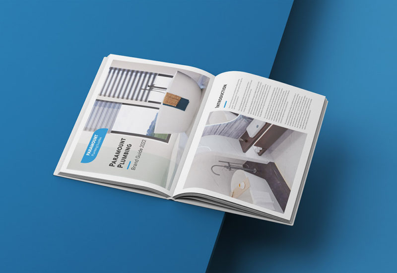
Paramount Plumbing approached Webmad seeking a rebranding fit to match their new website. They were after a brand style which referenced their old branding but was improved to match modern design trends. From this we could see their existing branding featured some industrial style typography that looked outdated and overly structured – overall very corperate. We took inspiration from the overall look and feel of the brand, updating the fonts to inspire feelings of comfort and professionalism while keeping the recognizable structure and colour of their existing brand. Encompassing this all in a rounded rectangular shape, we presented to the clients and they were very happy with the results.


